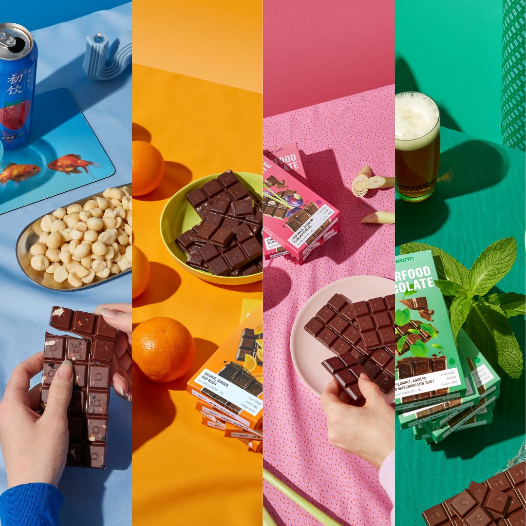
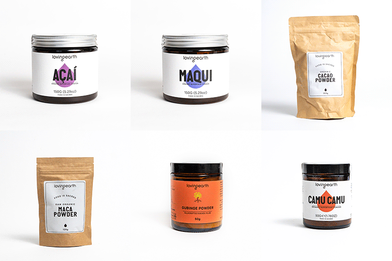
Today we show the world our new chocolate packaging! It's pretty exciting...in fact, no - it's VERY exciting! We've been working on this since last year and it took a LOT of doing before we were satisfied. If you look closely, you'll notice there's a whole system at play here...so why did we do this, and how does it work?
After investigating a large number of Melbourne design firms (and even a couple from further afield), we engaged Studio Round as a partner. We arrived at a whole new design rationale - a considerable departure from our old packaging. In the words of Loving Earth founder Scott Fry,
“It was about catching up with where the product was at – the chocolate has come through so much innovation and evolution, but the actual packaging has just become more and more confusing. We started with Agave sweetened chocolate, and then we added Coconut sweetened chocolate, and then we had the same flavours in the two different types…so we’ve been really good at confusing people! We had matured and grown and the chocolate reflected that – first of all we'd innovated by taking evaporated coconut nectar and grinding it with raw cacao, using a bean-to-bar approach…then by introducing the Coconut Mylk flavour, then the Caramel, now the Hazelnut and Cashew Mylk, so the products have become much more sophisticated.
"There’s a depth to the new packaging that’s not obvious at the start, visual imagery that’s not just artistic but is symbolic - it actually tells the story. There’s a system there, everything serves a purpose – and I love that, how form is function. But it really is a big change – you probably couldn’t have a bigger change.
"I think what we’ve got now is brilliant. I like the stripped-back feel, I like the feel of the board, I like the colours, the way it sits in different light and the three-dimensionality of it.”
Our variety of flavour bases are now represented by four unique illustrations:
DARK: a full cacao pod.
MYLK: cacao pod with a quarter cut away.
CARAMEL: cacao pod with half removed in a cross-section.
NUT: a specific nut - cashew or hazelnut, for example.
Each individual flavour is then represented by the colour of the top half of the box:
Mint: green
Lemon: yellow
Raspberry: red
Mandarin: orange
Salted: pink
Creamy Mylk: light blue
Hazelnut Mylk: purple
Caramel: tan
Dark: brown
Mylk: dark blue
This way we have a system in which it's clear what type of flavour you're getting - when the illustration is a half cacao pod, you know it's got a Caramel base, which is represented by the tan colour. When the illustration is quarter cut-away cacao pod, you know it's got a Mylk base, represented by the blue colour. As we expand the range we'll experiment with this a bit further
So now that our new packaging is on the shelves, what do you think about it?


